


(This article is an example of the sixth principle in my “00001010 Commandments of Data” article series)
Everyone who ever worked with my teams knows about the “Demand Analysis” tool, a single Excel pivot table that every analyst used to explore data and answer any question about all of the future demand for the company’s products and services.
(“Pivot tables” are a magical spreadsheet tool that helps people view the intersection of any combination of totals or subtotals in the data. “Demand” simply means the quantity of products or services that your customers are willing to purchase (at a certain price) in each future time period. )
If you asked any decision maker or analyst at the company, any time on any day, “What’s the total, future customer demand for the company’s products?” they’d all be able to give the same answer.
You can’t perfectly predict the future, but you can make sure everyone is talking about the same thing when they discuss what's coming next. That’s the data they spend most of their time thinking about anyway; after all, the past is written in stone, but people affect future results with their decisions. When people disagree, at least they’ll know what they disagree about.
Scenario Modeling
IT people usually focus just on the data in their systems, but that data makes up only a small part of the whole customer demand, especially as they look further into the future.
Let’s say you’re planning investments over the next three years:
In the near term, your customers place orders for the products they need, so you can see that demand directly from the data in your business systems.
You’re confident that they’ll continue to buy from you, but that’s a forecast. If business from that customer grows, your business may also grow.
But companies don’t just depend on their current customers’ growth; they also introduce new products and sell to new customers. Plans for new product introductions drive real, overall revenue growth.
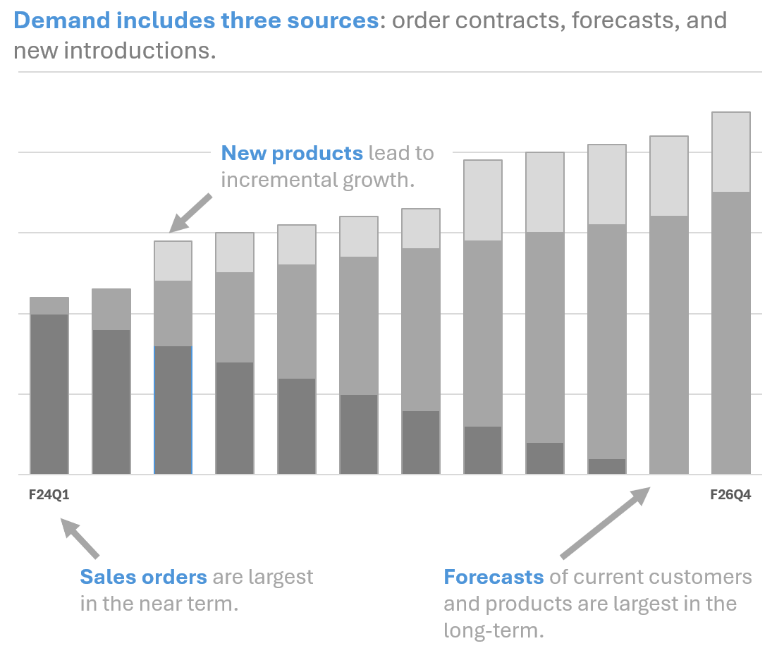
So, the “whole set” of data for demand includes three sources:
Orders from business systems (data “on the books”).
Forecasts from the planning teams in your company.
New Products from your product development teams. These might only exist in PowerPoint presentations.
I call this approach of mashing-up similar data sets together “scenario modeling”; people who write SQL code might call it a “UNION ALL”. Although each source contains a different level of detail, the “shape” of the data is identical between them, making them naturally fit together in a single pivot table. That makes it easy for people to see the broad definition of total demand in one view: it includes actual (historical) data, forecast data, and plan data.
You can use scenario modeling for any type of data, not just demand. Most business data includes those three data scenarios - actual, forecast and plan. Supply data for a manufacturing company, for example, has data for product received, on order, and forecasted receipts. Comparing forecasts to actual results is one of the most common types of questions an analyst asks, and this approach makes it easy for them to do that for the entire data set.
By adding a “scenario name” field to your data, analysts can easily use a Pivot Table to compare actual results to the plan and the forecast. It’s a great way to fit a lot more data into the tool and make it incredibly powerful for comparing entire sets of data to each other.
How Analysts Explore Data
Fitting these three data scenarios together might not seem obvious because they come from different places and with different levels of detail. But analysts naturally think of the overall demand totals first; it’s the only way they can know if their conclusions take everything into account. I spent the first eight years of my own career as a financial analyst, so I know how exploring data works: you start with the whole data set, then drill down, up, across, and through the data, working your way into the details until you’re satisfied that you understand the story behind the data.
If analysts can’t easily match subsets of the data to the overall totals, they can’t trust the data without extensive auditing. But when everyone recognizes that all the different parts of the data set roll up to the top-level totals used by executives, they gain confidence that everyone is speaking the same language when they discuss decisions.
Did this pivot table really capture everything? It certainly helped all the analysts at those global companies see all the demand for every customer in their world. A company with clear consensus like this makes much better strategic decisions.